Easier to buy
Clear hierarchy and thoughtful interactions guide customers safely through the buying journey.
A design is only finished once it works as a theme. We shape Shopify interfaces so that your content team and your developers can keep working with them.
Start a Project
Clear hierarchy and thoughtful interactions guide customers safely through the buying journey.
A design system keeps brand, components and states aligned across every shop page.
Reusable theme building blocks give your team more freedom for pages and campaigns.
Home, collection, product, cart and customer account as one connected system rather than a set of single screens. Every state is designed: empty, loading, sold out, failed.
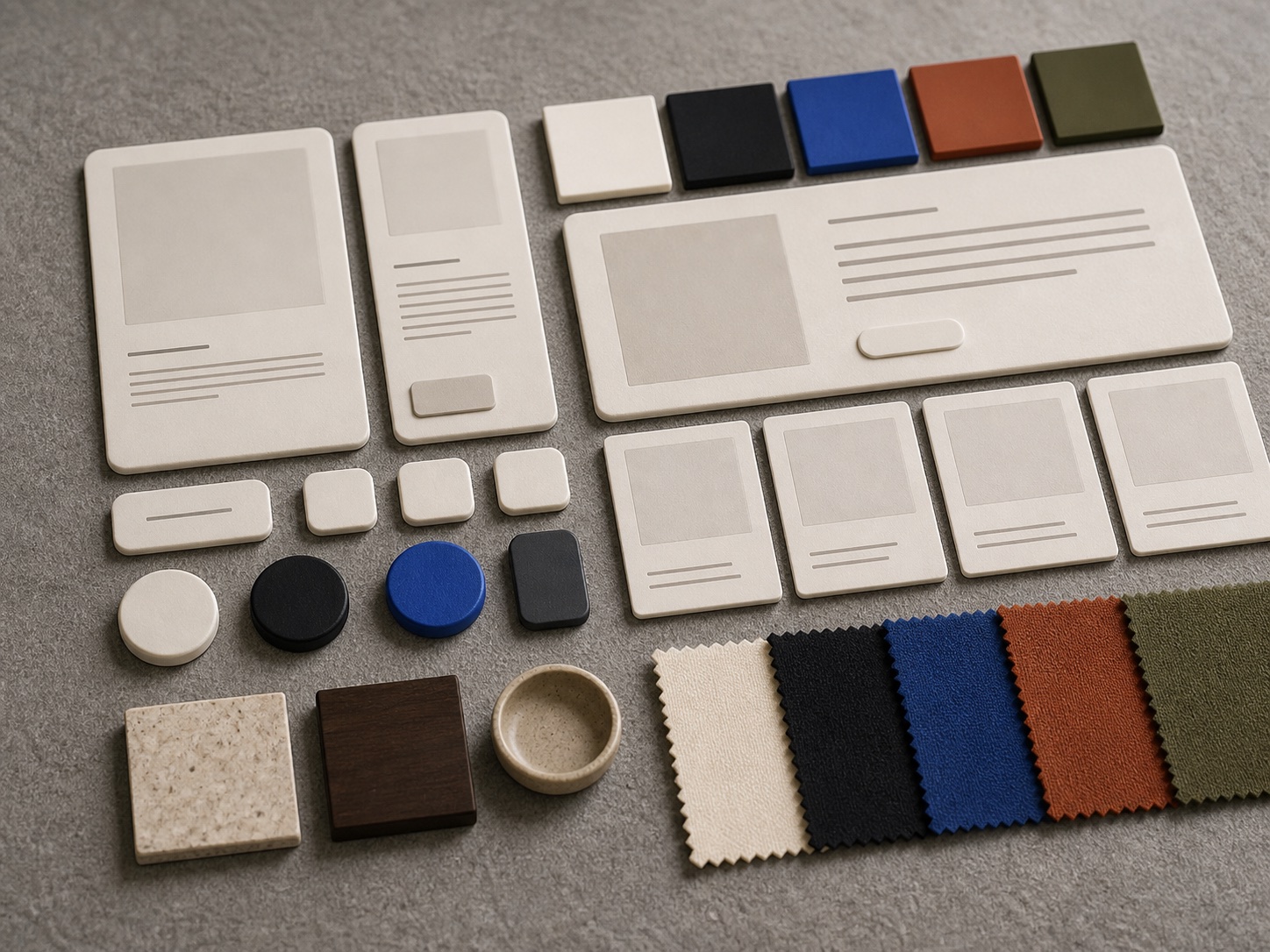
Colours, type scale, spacing and components live in theme settings and CSS variables, not only in Figma. A brand change then runs through settings instead of new templates.
Variant pickers, configurators, filtering and the cart drawer cannot be judged on a static screen. We make them clickable and test them before anyone builds them.
When positioning, range or audience no longer match what the store shows, no button test will fix it. That calls for a new design, not detail tuning.
Configurators, subscription pickers, B2B signup or bundles do not exist in a stock theme. They need a designed sequence before they end up in Liquid and JavaScript.
Over the years you end up with five button variants, three greys and four spacing grids. A design system clears that up and makes every later change cheaper.
If every campaign needs a developer, designed building blocks are missing. Sections and blocks solve that - but only if they were designed as a system first.
With the design in place, the work moves straight into Shopify development: theme architecture, sections, metafields, data model and performance. Design is no longer a separate project phase.
If you want more conversion from a store that already carries its weight, CRO is the route: hypothesis, test, evaluation. A redesign would be the more expensive tool with less certain effect.
If users drop out before the first pixel renders, that is not a layout problem. Core Web Vitals and loading behaviour come before any new design.
If it is unclear whether you need a relaunch, a migration or a partial rebuild, consulting settles that first. A design project started earlier often designs the wrong thing.
We review the current theme, analytics, session recordings and support tickets. We want to know where users get stuck today before we draw anything new.
We define page types, navigation and content building blocks. The result is a list of sections and blocks that later exists in the theme exactly that way.
Type scale, colour roles, spacing, states and components get defined. Everything gets a name that also holds up in code and in theme settings.
We design the page types within that system, including the awkward cases: long product names, missing images, sold-out variants, four-figure prices in a foreign currency.
We make the critical flows clickable and walk real users or your team through them. Changes are still cheap here; in the theme they are not.
We walk the design system, components and edge cases through with the developers. Then we review the build in the real theme, not in a screenshot comparison.
Empty cart, sold-out variant, form error, loading state. Whatever is not designed gets improvised in code.
Contrast, focus styles, touch targets and keyboard operation belong in the design - not in remedial work after launch.
Every section has limits: how much copy fits, which image formats apply, what happens when content is thin.
A design that ignores variants, collections and metafields gets expensive in the theme. The data model is part of the thinking.
The store was drawn on a large screen but sells mostly on phones. In that case the small view decides your revenue.
When customers compare, configure or check dimensions, an image and a price are not enough. That decision needs designed structure.
A second brand, a country store or a B2B offshoot should belong together. One shared system beats three themes maintained in parallel.
If a relaunch is coming anyway, the design belongs in front of it. The same decision costs far more inside a finished theme.
If the pressure comes from WCAG 2.2 AA and the German BFSG rather than from how the store looks, a redesign is an expensive detour to a testable finding.
To accessibilityIf attributes, images or stock levels are missing from ERP and PIM, every design will show the gaps. That is a data source question, not a layout one.
To system integrationLanguages, currencies, tax logic and shipping rules for another country do not emerge from a design. They shape the structure beforehand.
To internationalisationNot every store needs a full redesign - sometimes a solid look at what already exists is enough.

For stores with a hunch about where things go wrong, but no solid basis for the next decision.
Ends with a prioritised list your team can work through without us.
For stores where structure, templates and components need to be rebuilt as one coherent system.
Ends with a design system your developers can build from without follow-up questions.
For stores with running campaigns, a growing range and new content landing in the theme regularly.
Ends with new pages that look like the brand without anyone designing from scratch.
Brands with €950M+ GMV trust us
From migration to scale, NICCOS combines sophisticated design, robust technology and data-driven growth on Shopify.





A Shopify design meets a fixed data model of products, variants, collections and metafields. Designing against it produces special-case logic in the theme. The checkout adds another constraint: it is largely predefined and can only be adapted within set boundaries, which rules out some layout ideas early.
The state of the code decides that, not the wish for a new look. If the theme is cleanly structured and only looks dated, a redesign on the existing base is enough. If templates are layered with years of special cases and app leftovers, a new theme is usually cheaper than repair.
A design system that only lives in Figma drifts apart after the first sprint. We store colour roles, type scale and spacing as theme settings and CSS variables. Changes then run through the theme editor and take effect everywhere at once, without anyone touching templates.
For anything beyond a single click, yes. Variant pickers, configurators, filters and pre-checkout steps get judged in a clickable prototype with people from your audience. For detail questions on a live page, an A/B test from the CRO side is a more honest answer than a round of opinions.
As a requirement on the design, not as an audit afterwards. Contrast values, focus styles, target sizes for touch, visible labels and a sensible heading hierarchy are fixed in the design system. Retrofitting the same result costs a multiple - and usually forces visual compromises.
Yes. We often take the Shopify-specific part: translating the brand into theme building blocks, states, edge cases and the handover to development. Brand direction then stays with your team or your lead agency. All we need is clarity about who decides what.
We look at your theme, your templates and your numbers and tell you whether a redesign, an optimisation or nothing at all is the right next step.
Last updated:
NICCOS
The page could not be loaded.
Please reload the page. If an update has just gone live, this will load the latest version.